Pantone and Adobe have made it really difficult for designers and printers to communicate colors through a common language. In this guide, we will show you a workaround to help re-establish order among your brand’s colors.
What happened to the Pantone swatch libraries within Adobe?
The best explanation we have is an argument between the two companies on how the color-matching services should be charged going forward. Adobe removed several Pantone swatch libraries from Illustrator and Pantone came up with an ‘awkward at best’ solution with Pantone Connect.
Process numbers replaced Pantone colors in Illustrator
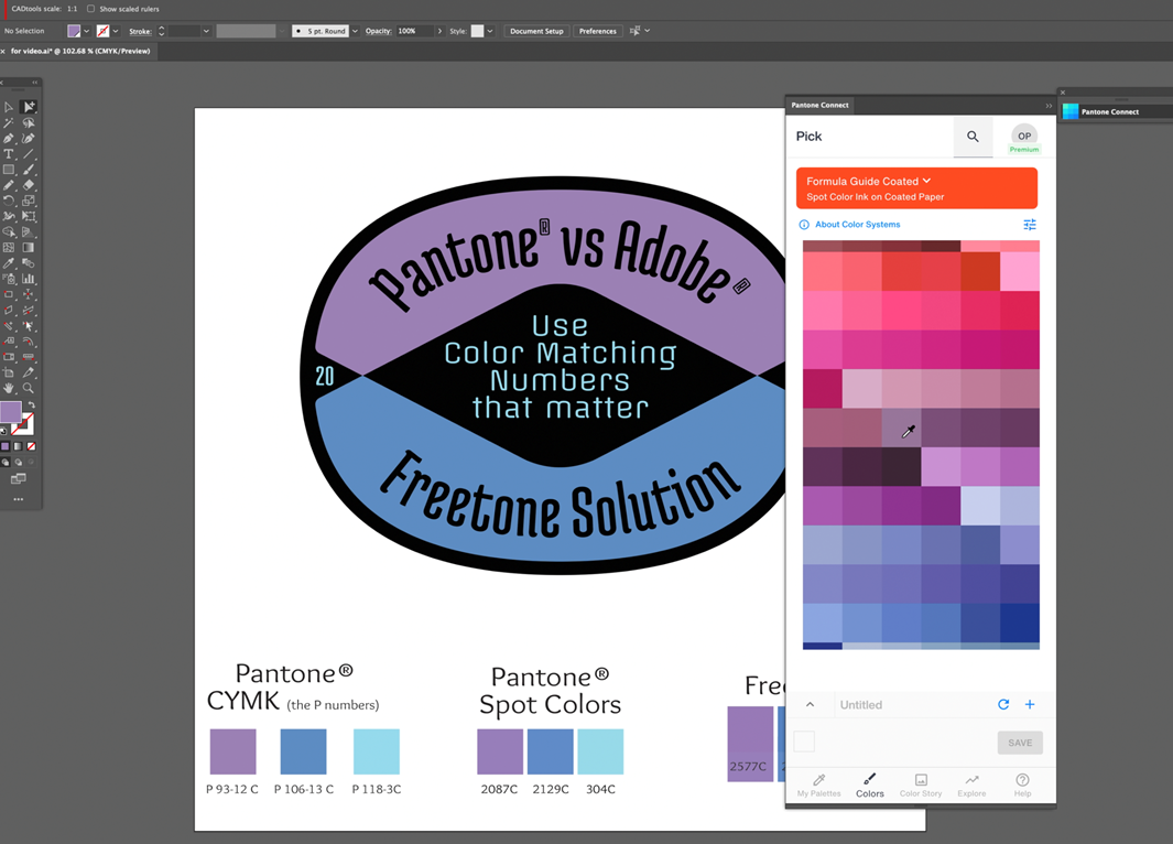
As a result of the argument, the Pantone swatch books in Illustrator were replaced with a newly created color system called Process Numbers (we call them P-Numbers). These color swatches don’t match up to any of the previous Pantone color numbers and create massive confusion for designers.
Process numbers will confuse printers and branding experts.
The Pantone matching system is really beneficial in branding because it provides a standard system used across all parties (printers, designers, brand owners) to keep color consistent. This primarily applies to spot color. The newly created Process Numbers do not correspond with the Pantone Matching System and therefore create confusion.
What should designers do going forward?
Until Adobe or Pantone come out with a better solution, we believe it’s best to find a good workaround. FreeTone appears to be the best solution currently available.
FreeTone has closely replicated Pantone colors and assigned a number to each color. The FreeTone colors cover 1,280 of the 1,800 Pantone colors available. This works for most creatives! Give it a try and let us know what you think!
Matching Pantone Colors for Stickers
Color matching is an important part of ordering stickers! Customers who work with our CGpro team have the option of requesting exact color matches for any color within the Pantone library. This is very important for brands looking to keep colors consistent among various products such as outdoor stickers, custom product labels, and retail graphics.
By using the FreeTone solution, we will be on the same page as your design team when it comes to color matching!
Interested in Outdoor Stickers for your brand?
We would love to help you print some amazing branding stickers! Click the link below to get started.
